Target Audience
Best website
URL: Forever21.com
- The age demographic for Forever 21 are aimed at mid teens to mid 20's with an income of approximately $30,000. The education
level portrayed in the clothing are both sophisticated and casual. Due to the look of the clthoing style choice,
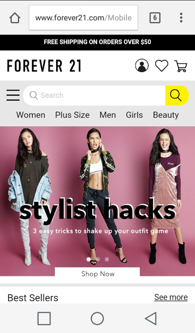
the geographical location most fit for this is urban more than rural. - This website does a great job in response to the audience's needs. The content wanted from this website is to know the prices
of clothings, new offers, etc. Although the clothing looks more urban, according to the site, there are multiple store locations
therefore, shipping should not be a problem. - The content is well organized and easy to be found because there are links located at the top of the page which includes a drop down menu
next to the search bar. - My mobile browsing experiece was plesant because when the website shrank to a mobile device, it was still appealing to the eye.
- This site really does facilitate people by adjusting to a mobile environment, allowing the user to avoid zooming in.
Persona

- Emma is 21, lives in Los Angeles,CA and loves to shop. Although shopping can lead to serious debt, she needs to find
a clothing store where the prices are affordable yet have great quality. - Her goal is to be viewed as sophisticated but casual in her appearnce. She drives a Sedan and has a full-time job, therefore
she needs her items to be shipped to avoid spending more gas money and missing work. - While searching for online stores, Emma came across Forever21.com and it completely covers all her required needs as stated above.
- Question: What does a typical day look like?
- Emma:"A typical day looks chaotic but with Forever 21, my life has more clarity because of the organized layout. I can find the items
I need and fast. Everything is in a click of a button and all shipped directly to my home so I never have to leave!"
Site Contrast
Worst website
URL: Libertyvan.com
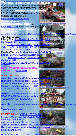
- It was very difficult to know who the target audience was. It was hard enough to try to figure out what the website was about.
After much reading and pondering, then I could faintly pick out the intended audience. - This website does not meet the needs of the audience because it is very difficult to navigate content. Visually, it is very unappealing
therefore hard to satisfy the audience's requirements. - Liberty Van did not do a good in organizing their content because everything seems to mix in. Although they bolded some titles,
they did not make it apparent and clear. - The site did not facilitate visitors in the mobile environment because the text runs over the images.